Lo4 D2 Before and after images of my edited products

This shot has been described as looking like an establishing shit for a movie. I rated this image 4 stars as I loved the reflection that the neon lights reflected onto the car bonet. However, I still believed it needed to be edited, to ensure it reaches it full potential. The image itself manages to capture the bright nightlife that is present in Doncaster and uses the rule of thirds to add symmetry to the image.


This image, of the church located in Doncaster town, was taken at night. I adjusted the shutter speed of the camera in order to achieve this shot. I wanted to present the church as this bright large building that and show the depth and scale of the church through the perspective and angle of the shot. However, I disliked to out come due to the bright starburst effects that appears due to the lights captured in the shot.


 \
\This image was taken at night, and utilised a slow shutter speed to achieve a the bright elongated lights in the image. When editing the photo, I wanted to crop it to get rid of a lot of the dark areas that contrasted with the road. It also made the image more linear and parallel, which utilised the leading lines rule, and make the image more symmetrical and appealing.


After this, I began to edit the colours of the image. I started by lowering the highlights off the image, this made the lights from the cars seem more like beams as the illuminated less light. I really liked this effect, as it made the image more detailed. To emphasise this, I also increased the shadows which made the light beams stand out more. Overall I really liked this image and felt that it only needed minimal editing to make it become an outstanding product.


This image isn't my favourite image, but I still believe that it has an interesting perspective, again using the leading line rule to make the image flow well and lead the viewer into the big open space in the background of the image.
To edit this image, I highlighted the path with the paint tool. This aloud me to edit this specific part of the image, meaning I could highlight this path enhancing it and making it a vocal point of the image. To achieve this effect, I increased the exposure, and decreased the contrast. This made the path very bright and standout to the viewer, However, doing this made it look unrealistic and over exposed, so to fix this I turned the highlights of the path down, which made the shadows standout a lot more, balancing the image.


I problem I found with this image was the dried grass that is on the left of the image. I wanted to get rid of it and make the image look more prettier and greener, as to relate more to how beautiful Doncaster is. To fix this, I used the healing brush which aloud me to overlay the ugly parts of the image with other parts of the image that looked better. This made the image look more symmetrical and pleasing, it also shows my skills as a photographic editor and how I managed to utilise the tools I was given to make my image look better for the purpose of making Doncaster look better.


Similar to the previous image, I used the healing brush to get rid of the lamp that was directly in the middle of the shot, and cluttering the image, ruining the flow of it. I used the healing brush to swap the lamp with other trees and branches, overlaying the lamp with a tree, which fits within the image.


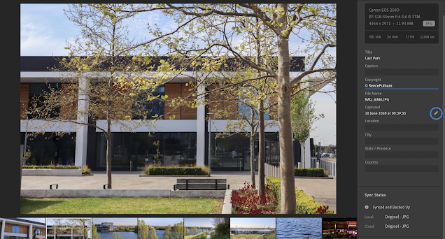
Here is a screen shot of how I cropped the image and made it flow better. Below this image is also the settings that I changed to make the image more saturated and warmer. I specifically increased the highlights and shadows to make the image more brighter and increase the whites. With this the image was very bright and looked overexposed especially in the sky. Using J on the keyboard showed what parts of the image were overexposed, with this I was able to find out what was wrong with the image so I knew what to fix. So, I then decreased the whites and increased the blacks fully which was able to make the image look dark and bright at the same time. The sky was now fully detailed but the colourful and saturated flowerbed was still bright and beautiful.


When I originally took this photo, I felt as if I had used too much space in the photo and that it needed cropping which could allow more focus to be brought to the duck. Cropping it would also make the golden circle featured in the image flow more easier and make the image more appealing.

I loved how the water looked in this image, it seemed smooth and open when I originally took the photo, However, it also looked dark and slightly boring contrasted with the duck, as they blended in so well. So, when editing this image I made sure to make the water look colourful and bright, allowing a clear contrast between the duck and the water. To achieve this, I slightly increased the exposure of the photo, and increased the blacks and decreased the contrast of the image. This made the image a lot brighter, and the water looked very colourful and beautiful to the eye. Even with this, I wanted to keep some of the shadows found in the waves of the water, so I decided to decrease some of the highlights of the image, which gave the water depth, and also limited the possibility of over exposure in my image.


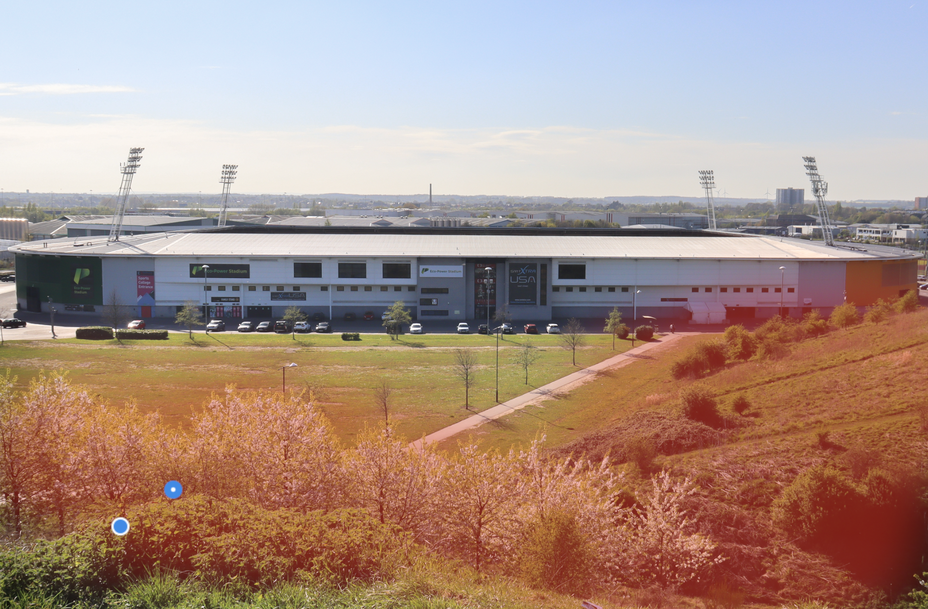
For this image, I made sure to make the green areas of the image brighter and more exposed than the rest of the image. This was done as to make the image more appealing and allow it to flow more easier. Plus, I cropped the image to get rid of any unneeded spaces that could have been in the image. It also aloud me to utilise the rule of threes even more, as the stadium that was placed directly in the middle of the image as able to split it into three different sections that made it more beautiful and easier to view.


Similar to my other shots, I highlighted the focused object and edited the saturation and exposure on it to create a bright and warm focus point point that could lead the viewer into the rest of the image. By doing this I made the show more appealing and made it flow better throughout the rest of the image.

As you can see I only edited the saturation slightly, as I didn't want to make the image look too bright and warm and instead wanted the image to look like a warm sunny day, which would compliment the white and green colours of the urban and natural landscape.


The original image that I took featured a bright poster in the corner that detracted from the image and took all the attention away from the viewer. So I used the healing brush feature to replace this with the black door from the other building. This seemed very difficult to begin with, but it became easier to use the more that I attempted it. In my opinion, the poster still seems to be hidden in the image slightly, so I may go back and try to edit the image again, planning on getting rid of the poster completely as to make the image clean.


After I moved this photo into Lightroom, I began to use the healing brush to replace the Lamp, seen in the image, to trees that fit the style of the image. I removed this part of the image because it didn't fit within the picture and took attention away from the beauty of the lake and the wildlife with the lake.

The final product that is shown on screen works well as the lamp has been taken out of the image completely and replaced with branches and trees from the surrounding image. It blends well and looks good in the final product after editing it fully.

The highlighted sections within the image are of the surrounding trees and greenery that are in the photo. I wanted to highlight these sections as I would be able to edit them separately from the rest of the image. I wanted to make the trees more saturated and exposed as to make them stand out more along the final product. In most of my images, I wanted to make the nature within these images seem more alive and beautiful by saturating the colours and increasing the highlights. In this photo, this works well, as the contrast between the dark blue water, and the bright green trees create a great contrast and make Doncaster seem like it is full of natural landmarks that improve the wildlife on the city.

This is the settings data for the whole image, You can see that I have once again decreased the highlights as to limit the over exposure that is in the image. I also increased the shadows of the image to create more detail within the trees and wildlife areas.


Comments
Post a Comment