Lo1 M1 My styles of photography
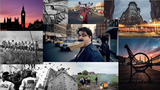
This is a report into the styles of photography that I have taken and worked on recently. I really like to take documented images of of urban infrastructure and how small things in the image can represent what the artists was thinking while taking the picture. I enjoy taking pictures that document urban landscapes, fashion, and crating cover art for albums and mixtapes.
This is a documentary style image of Japanese urban infrastructure. The image is a mix of photography and graphic design as I heavily edited the image until it fit the style of the album I made it for. I liked the Japanese culture that was in the image and I duplicated the the layers so that I could stretch and morph the image to make it very psychedelic and trippy. The location was purposely chosen as the Japanese road signs and text link to the anime aesthetic the mixtape features, as I use lyrics and samples that are from anime and Japanese culture. I was inspired by the Luv is rage 2 and other Lil Uzi Vert album covers when making this. Specifically the Luv is rage 2 cover imagery, shot and edited by Virgil Abloh. That cover art featured the artist in the middle of the shot and used edited imagary to fit with the theming of the music within the album. He specifically placed the artist behind an X made out of Off White tape, as the artist talks a lot about money and fashion in his music. I have done something similar with my image, as I have have covered the women in neon colours and morphed imagery to emphasise how colourful and psychedelic the music is.
This image was taken while I was walking near the Savoy cinema while it was raining. I thought the shot represented a very depressing but melancholy feeling as it features both the new and old urban landscapes of Doncaster, showing how Doncaster is becoming a more modern town. The image is unedited, but it has a very desaturated look. This is because the weather was very depressing and dark at the time, this gave the image a very sad theming similar to Steve Mccurry's work. His work is what inspired me to shoot shots like this. The wide open space makes the image feel empty and also makes the are look larger compared to the people on the right. They look small compared to the rest of the image and are cast to the side as to make the space look more empty and wide. Next time taking a shot like this, I would shoot it at night, and change my shutter speed so that passing cars or people would leave light trails. I would also compose the image better and shoot it in a way so that I can edit out the lamppost as it clutters the frame.
This is a simple portrait image of Toby that I took while in college. I experimented with the depth of field of the image so that I could make the background and the bottle would be blurred out while Toby is not blurred out and in the foreground. The photo was taken quickly and Is only to test how I would use depth of field in my images.
This documented landscape photo is of the symmetrical urban landscape of Doncaster. It is a very unappealing area and looks very liminal at times. I choose this as it was very similar to works by Steve Mccurry as in it shows the more unappealing areas of a culture or place. When taking these style of photos I would not take then in the similar style as Bruce Gilden, this is because I don't want to take photos of people without consent and risk being hurt or attacked. Plus his style works best when taken in the chaos of a busy street which I do not want to focus on.
The golden ratio theory:
The golden ratio is a shape that can be used to form an image. I the image you are taking is a rule of three, then you can use the golden ratio to place an object or subject in the corner of your photo. it helps the flow of the image and makes it more appeasing for the audience.


Comments
Post a Comment